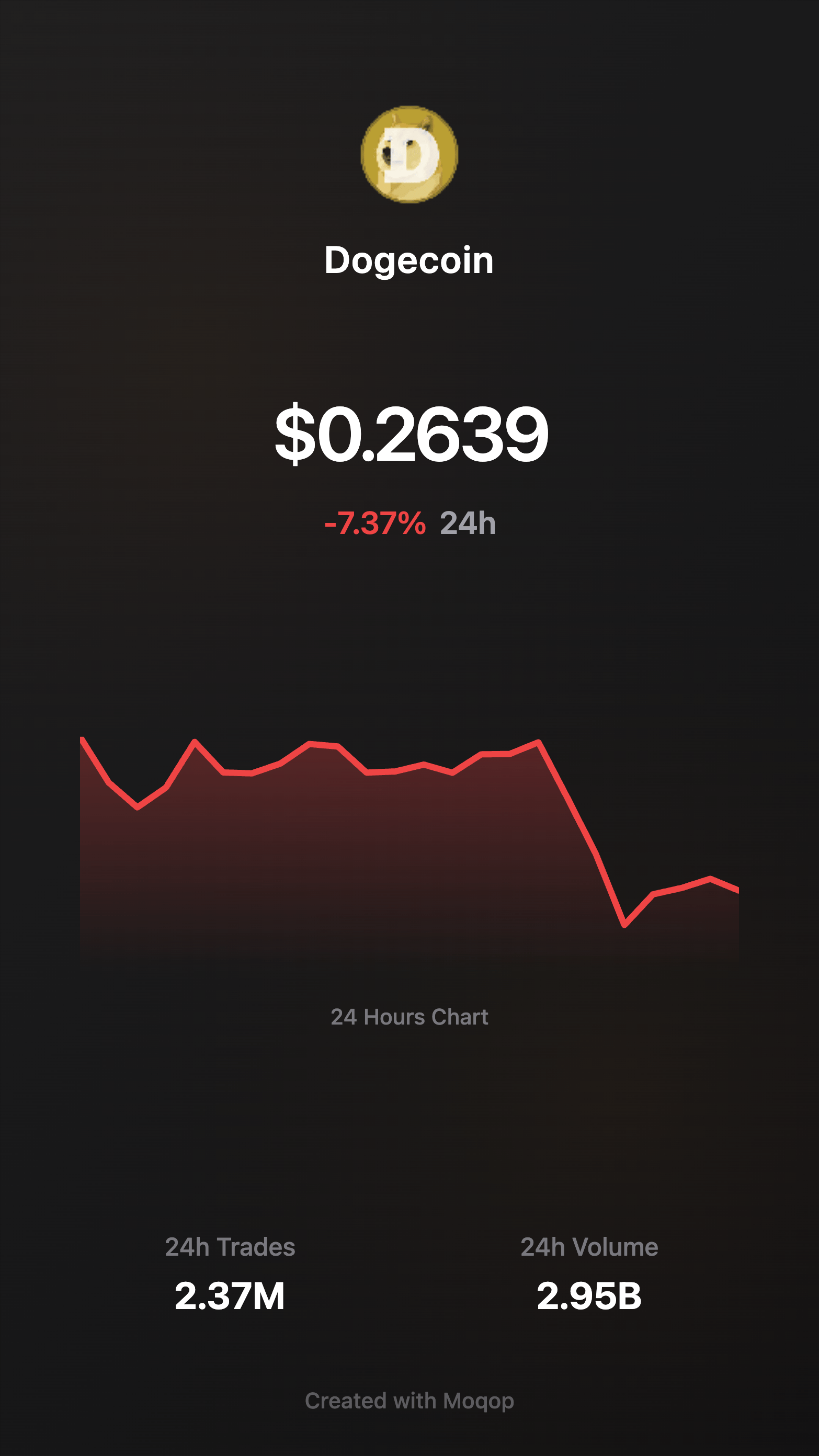
How Crypto Traders Create Coin Price Charts for Social Media
Built for Cryptoto
 Instagram
Crypto content has a timing problem. A coin breaks resistance, a portfolio hits a milestone, market sentiment shifts—and the moment to post about it is now, not after twenty minutes spent screenshotting a cluttered trading interface and cropping it into something presentable.
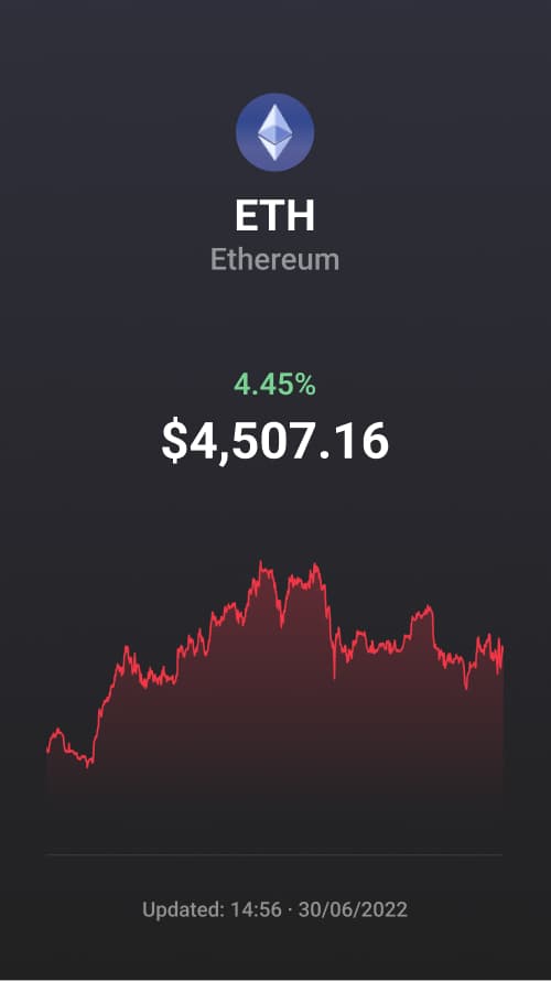
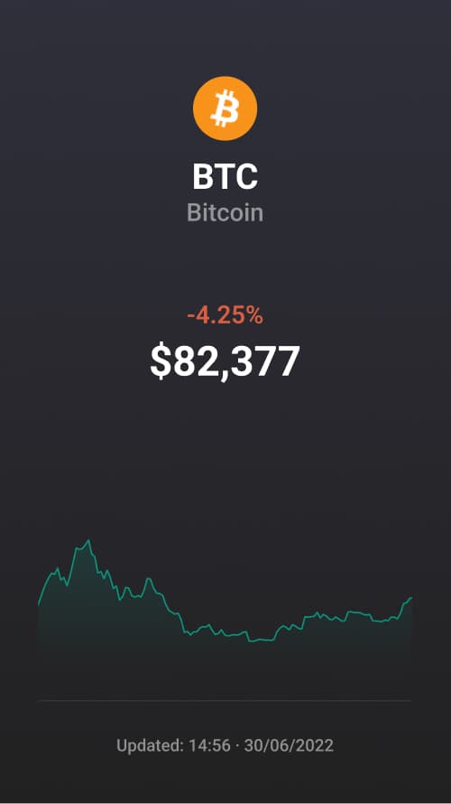
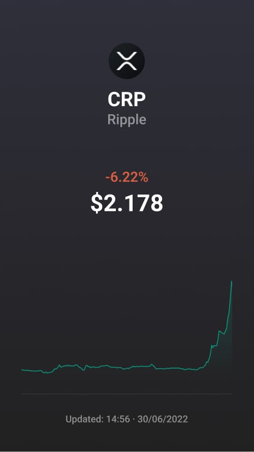
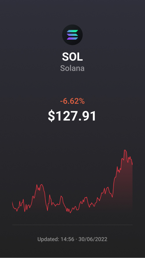
Automated chart generation solves the speed problem directly: connect to live exchange data, pick a coin and timeframe, and get a clean, Instagram-ready chart in seconds instead of minutes.
How it works
- Pull live market data. Real-time price feeds and historical data for 1,000+ cryptocurrencies, sourced directly from exchange APIs like Binance.
- Choose your focus. Pick the coin, and a timeframe from 1 day up to 1 year.
- Generate the visual. A styled chart is rendered instantly, with key metrics placed clearly and sized for Instagram Stories (9:16) or feed posts (1:1).
What makes it worth using
Coverage. From Bitcoin and Ethereum to smaller altcoins and DeFi tokens—if the exchange lists it, you can chart it.
Timeframe flexibility. Day traders get 24-hour snapshots; long-term investors get year-over-year views. Same tool, different story.
Design that doesn't distract. No cluttered trading UI, no chart-junk—just the price action and the numbers that matter, styled consistently whether it's a bull run or a crash.
Light and dark themes. Dark works well for dramatic moves; light suits calmer, educational posts.
Why traders are adopting this
The advantage isn't really about design—it's about not missing the moment. When a chart takes seconds instead of minutes to produce, you can post about a breakout while it's still happening instead of after the window has closed. And because the output looks consistent post to post, it reads as more credible than a hastily cropped screenshot, which matters in a space where trust is scarce.
For daily traders, that means quick morning overviews and real-time breakout alerts. For longer-term investors, it means clean monthly or yearly performance recaps. For educators and analysts, it means being able to illustrate a point with a chart instead of describing it in text. In all three cases, the time saved on production is time spent on the analysis that actually matters.
Try Crypto to Instagram
template now